top of page


BACKGROUND
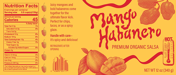
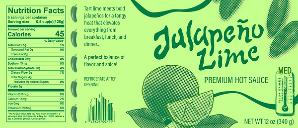
I created a fictional salsa brand and designed packaging for three different flavors that feature a main fruit ingredient. The goal was to make something that felt bold and artisanal, but still clean and marketable. I wanted the designs to stand out on a shelf without feeling overdone or gimmicky. I focused on building a strong, consistent look while giving each flavor its own personality. The final designs were applied to mockups to show how they would look in a real-world setting.
PROCESS
The main challenge was finding the right balance between handcrafted and professional. I needed the designs to feel flavorful, exciting, and slightly rustic without looking messy or homemade. To solve this, I started by brainstorming brand ideas and thinking through the story each flavor would tell. I explored typography, color palettes, and illustration styles that felt fresh but still tied back to the idea of bold, handcrafted quality. I built a structural system that stayed consistent for things like fonts, layouts, and even LPI for the halftones I used. I let the colors and specific graphics shift depending on the flavor.
PROBLEM
In a crowded market, a lot of salsa brands either look too homemade and messy or overly commercial and generic. There’s a gap for products that feel bold, flavorful, and authentic while still looking clean and polished enough to grab attention on a store shelf. This project was about solving that — creating a brand and packaging system that could feel handcrafted and exciting without sacrificing professionalism or shelf appeal.
STRATEGY
Before designing, I looked at a range of salsa, hot sauce, and other condiment brands to see how they balanced authenticity and shelf appeal. I noticed that brands with bold colors, playful illustrations, and strong typography tended to stand out the most without feeling overly commercial/mass-produced. I also paid attention to how they communicated flavor on the packaging to make sure things like fruit or pepper imagery were clear enough to signal the taste experience right away.
bottom of page