top of page


DOOMSCROLLING
EDUCATIONAL INSTAGRAM CAMPAIGN


BACKGROUND
This Instagram carousel series aims to raise awareness about doomscrolling-- the habit of endlessly consuming negative online content, its effects on mental health, and how to break the cycle. The campaign focuses on leveraging typography and color to effectively communicate a message while maintaining a cohesive visual identity.
PROCESS
I began by researching the psychological effects of doomscrolling and the environments that encourage it. I also looked at how wellness-focused brands speak about complex topics on Instagram, noting the importance of visual simplicity, bold typography, and short, digestible chunks of text. I identified the target audience as young adults aged 18–30 who spend significant time on social media and are interested in mental health or digital wellness.
PROBLEM
Doomscrolling has become a widespread and normalized behavior. While many users engage in it daily, few recognize how it quietly impacts their mental well-being, leading to stress, anxiety, and disrupted sleep. There is a need for more digestible, relatable content that both informs and empowers users to step away from the scroll.
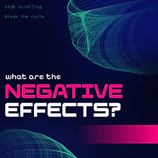
STRATEGY
I chose a three-part structure to mirror a progression:
Post 1 – Awareness: What is doomscrolling?
Post 2 – Effects: How it impacts your body and mind
Post 3 – Action: How to break the cycle
Each carousel uses strong visual cues and a scrollable narrative structure to keep users engaged which ironically uses the format of scrolling to promote less of it.
bottom of page